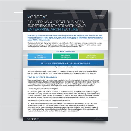
Embrace the notch
Last year, only one Apple phone had a notch in its screen—the iPhone X. With that, Apple introduced a whole new paradigm for end users and app designers. Since only one phone featured this design, many applications simply used letterboxing, instead of embracing the notch and taking advantage of the increased screen size. Now, all of Apple’s flagship phones are shipping with a “notch” similar to the one introduced last year on the iPhone X. If you haven’t already embraced the notch, now is the time to do so. This year’s Apple Watch has been completely redesigned. It’s thinner and has a larger screen, one that almost completely eliminates the bezels. It can even perform an ECG! The problem is, these new screen sizes create fragmentation for developers in the same way a million different Android phones do.
New watch sizes
As with iPhone and iPad apps, Apple Watch apps need to be designed with adaptive layouts in mind. WatchKit’s layout system is simpler than Autolayout’s. Sometimes this tempts developers to use fixed sizes when implementing the layout for watch apps. This was a reasonable implementation when only handling two screen sizes—as at most, there were two values to worry about. But this new announcement throws a wrench in that plan by introducing two additional sizes. Developers may be tempted to simply add constants to adapt to the new screen sizes, but I caution against that. The best way to build applications to handle the future—including screen sizes that haven’t been revealed yet—is to build your layouts to be as adaptive as possible.
This announcement suggests Apple isn’t afraid to mix things up as far as their new hardware screens are concerned. So from now on, designers and developers need to create iOS and WatchKit applications not only for current phones and watches, but also with adaptive layouts for future models in mind. If your organization needs help designing, developing or updating its mobile applications for the new devices (or for the new iOS), please don’t hesitate to contact the mobile development team at Anexinet today.
Related Content

Matt Klinkhammer
Senior Mobile Development Specialist
Matt Klinkhammer is a Senior Mobile Development Specialist with Anexinet. His applications and platforms are used by some of the world’s largest finance, energy, insurance, publishing and food & beverage companies. Matt holds a degree in Information Systems Technology from the University of Tulsa.
© 2000 - 2021 Anexinet Corp., All rights reserved | Privacy Policy | Cookie Policy